
Flying is Hard
Menus and Localisation
With the first iteration of in-game UI behind me I decided to continue my gameplay programming break and try to get a prototype main menu made up so the project would feel more like an actual game. Even though it's a prototype menu I wanted it to feel cohesive with the stuff that's already been done, so I tried whipping together a title screen logo using the same colour palette and assets.

I'm actually quite pleased with it and may keep the concept for this logo around but will probably end up changing up the typography. From there I needed to set up the rest of the menu structure, and for this mostly placeholder iteration decided to keep it super basic and didn't really spend any time on design outside of moving some text around within Unity. I used the same colour palette and fonts I've been using throughout the project to tie everything together.
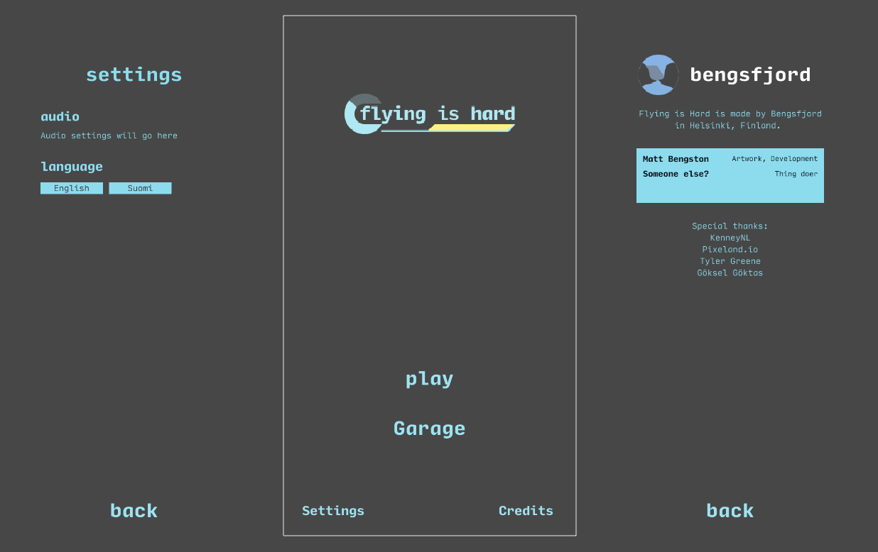
While this is a quick prototype menu I do want it to be the foundation of the final menu design, so I tried placing things in a pleasing way. My vision for the final menu includes one of the worlds in the background with a slight blur/frosted glass overlay for some ambience, so I tried positioning things with that in mind.
Even though technically that was all I needed to do, I couldn't help but want to spice it up a bit. So with spiciness in mind I added some basic transitions to the different navigation states and threw some localisation into the mix.
I made the transitions using the in-editor Animator, so those are pretty basic. The localisation wasn't too hard to add either, and actually kind of fun to implement. If you want to check out some more in-depth information and examples on how I implemented the localisation system, you can see those on my blog.
Leave a comment
Log in with itch.io to leave a comment.